In a world where first impressions form within milliseconds, the visual language of your brand speaks before you say a word. Research shows that 94% of first impressions are design-related, making your choice of graphic design style one of the most critical decisions for your business success.
Whether you’re launching a startup, rebranding an established company, or creating marketing materials, understanding different graphic design styles can transform how your audience perceives and connects with your brand. From the flowing curves of Art Nouveau to the clean minimalism dominating today’s digital landscape, each design style carries distinct cultural meanings and emotional associations that can either amplify or undermine your message.
This comprehensive guide explores the evolution of graphic design styles from classic movements rooted in the 20th century to cutting-edge digital aesthetics shaping 2025. You’ll discover how to identify key characteristics of each style, understand their cultural context, and learn strategic approaches for selecting the right graphic design style that resonates with your target audience while achieving your business goals.
What Are Graphic Design Styles and Why Do They Matter
Graphic design styles represent distinct visual approaches that combine typography, colour palettes, layout principles, and imagery to create cohesive aesthetic languages. Each graphic design style serves as a communication tool that instantly conveys brand personality, cultural values, and emotional associations to viewers before they process any written content.
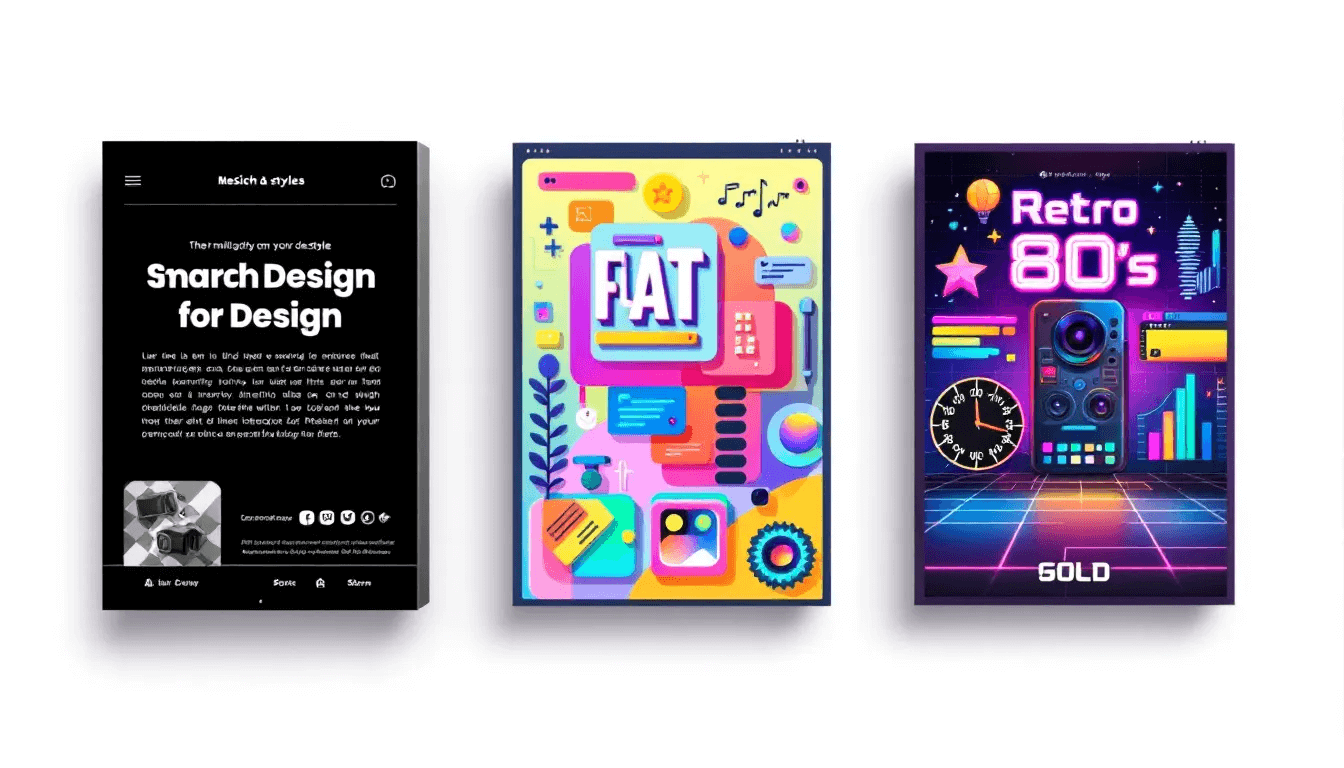
The importance of design styles extends far beyond aesthetic preferences. They function as powerful psychological triggers that influence purchasing decisions, brand loyalty, and user engagement across all marketing materials. When you choose a specific design style, you’re essentially selecting a visual vocabulary that will speak to your target audience’s subconscious preferences and cultural associations.
Different graphic design styles have evolved alongside technological advances, cultural movements, and changing consumer behaviours throughout history. The emergence of digital tools has democratized design creation while simultaneously introducing new challenges around visual differentiation in crowded digital spaces. Modern brands must navigate between honouring design traditions and embracing innovative approaches that capture attention in fast-scrolling social media environments.
The strategic application of design styles impacts every touchpoint where your brand meets the world. From web design and mobile applications to promotional materials and packaging, consistent style application creates recognition patterns that build trust and memorability. Companies that master the art of style selection and execution often achieve stronger brand recall and customer loyalty compared to those using generic or inconsistent visual approaches.
Understanding design elements within each style enables more sophisticated brand storytelling. Colours, typography choices, spatial relationships, and visual elements work together to create emotional responses that can influence customer behaviour, perception of quality, and willingness to engage with your content or products.
Classic Graphic Design Styles
Art Nouveau (1890-1910)
Art Nouveau emerged in late 19th-century Western Europe as a revolutionary departure from academic artistic traditions. This influential movement prioritised hand-crafted detail and natural inspiration, creating designs that celebrated organic forms through flowing curves and intricate botanical motifs. The style’s emphasis on artisanal quality positioned it as a bridge between traditional craftsmanship and modern industrial design approaches.
Artists like Alphonse Mucha perfected the integration of text and imagery, creating poster designs where lettering appeared to grow naturally from surrounding decorative elements. Compositions often carried a distinctive sense of elegance and harmony, reflecting the cultural fascination with beauty, nature, and craftsmanship during that period.
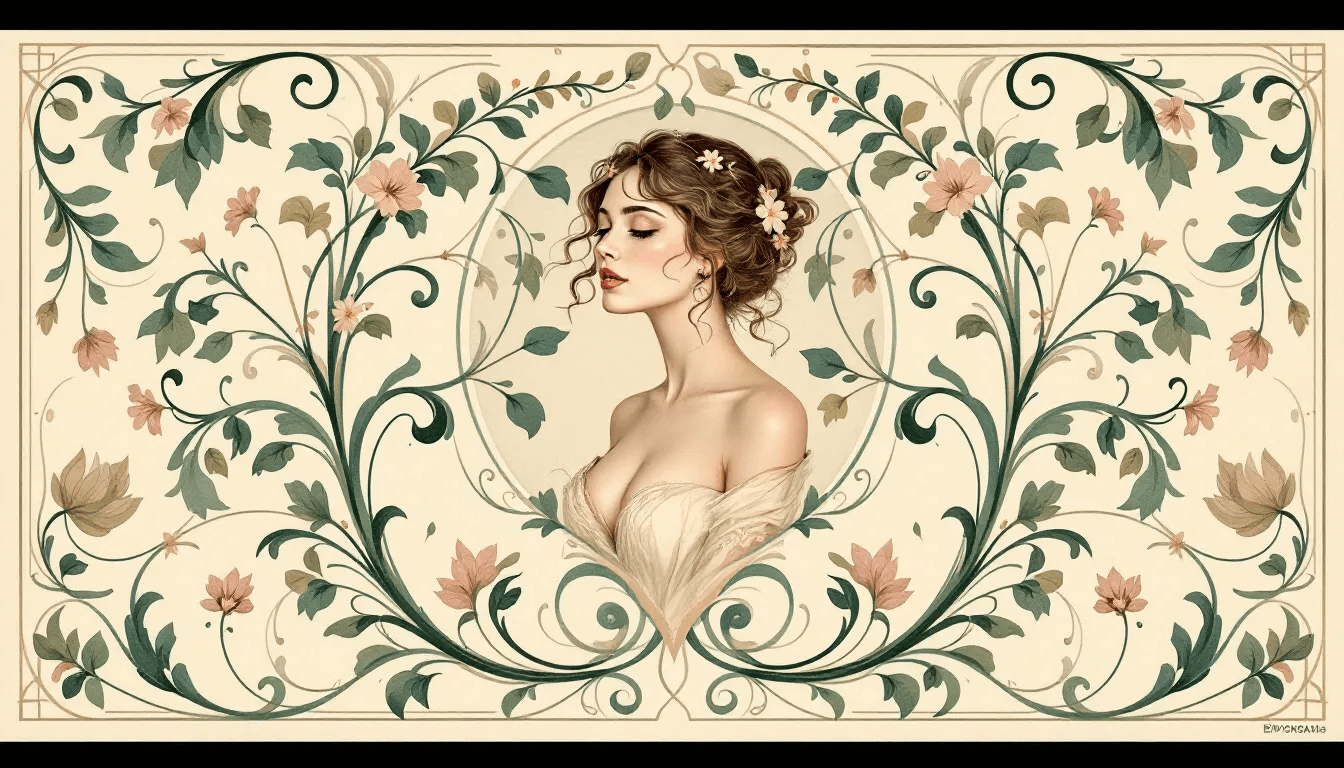
In modern contexts, Art Nouveau principles frequently appear in luxury branding, particularly for products emphasising natural ingredients or artisanal quality. The hand-illustrated aesthetic provides an effective counterpoint to digital uniformity, helping brands stand out through visible human craftsmanship. Still, the style’s complexity requires careful consideration of scalability across different media formats, as intricate details may lose impact when reduced for mobile or social applications.
Characteristics
✓ Flowing curves and botanical motifs
✓ Bold outlines with delicate inner detail
✓ Typography resembling organic growth
✓ Rich warm palettes with golds, greens, and burgundy
Best for
✓ Luxury branding with artisanal focus
✓ Beauty, wellness, and gourmet sectors
✓ Packaging that connects craftsmanship with premium positioning
Mood/Tone
✓ Elegant, romantic, handcrafted
Use Sparingly When
✓ Designs must scale to small digital formats
✓ Intricate detail risks being lost in mobile or social media
Art Deco (1920s-1930s)
The Art Deco movement emerged in post-World War I society as a bold expression of optimism, technological progress, and economic prosperity. This graphic design style symbolised luxury and sophistication through its integration of machine-age aesthetics with decorative arts traditions. It spoke to an era embracing modernisation while maintaining appreciation for crafted beauty and elegant presentation.
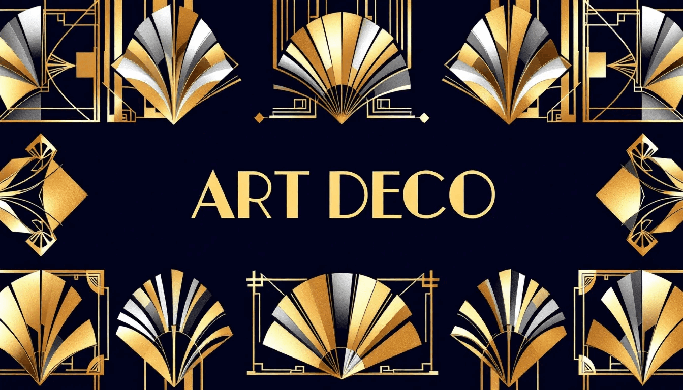
Modern brands frequently revive Art Deco elements when targeting audiences that value tradition, quality, and exclusivity. The style’s inherent associations with glamour and celebration make it particularly effective for event promotion and high-end service industries. It suggests historical prestige and forward-thinking innovation simultaneously, making it suitable for brands positioning themselves as established yet current.
Characteristics
✓ Strong geometric symmetry and architectural verticals
✓ Streamlined curves suggesting speed and progress
✓ Metallic accents (gold, silver, bronze) with bold contrasts
✓ Angular, decorative typography with capitalised letterforms
✓ Rich colour pairings such as navy and gold, emerald and silver
Best for:
✓ Luxury services, hospitality, and premium packaging
✓ Travel, automotive, and high-end beverage branding
✓ Event identity systems and celebratory campaigns
Mood/Tone
✓ Glamorous, sophisticated, confident, celebratory
Use Sparingly When
✓ Projects require minimalism or subtlety
✓ Audiences may find opulence excessive or outdated
Swiss/International Style (1940s-1960s)
The Swiss Style revolution began in 1940s Switzerland, fundamentally reshaping graphic design through its emphasis on objectivity, clarity, and systematic organisation. This influential movement, also known as the International Typographic Style, prioritised functional communication over decorative elements, establishing principles that continue to dominate corporate design and digital interfaces decades later.
Josef Müller-Brockmann’s pioneering work established many conventions still used in modern design practice. His concert posters demonstrated how sans serif typefaces, particularly Helvetica, could achieve both aesthetic appeal and optimal legibility. The integration of photographic images with typographic elements created powerful visual narratives that influenced generations of designers working in corporate and institutional contexts.
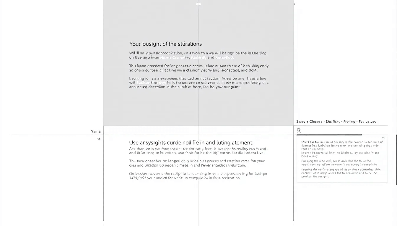
The lasting impact of Swiss Style appears throughout contemporary corporate design, from annual reports and business presentations to website layouts and mobile app interfaces. Modern applications extend beyond traditional corporate contexts, with Swiss Style principles influencing web design frameworks, user interface development, and digital publication layouts. The movement’s focus on accessibility and universal comprehension aligns perfectly with contemporary needs for responsive design and cross-cultural communication.
Characteristics
✓ Grid-based structures ensure mathematical precision
✓ Asymmetrical yet balanced compositions
✓ Sans serif typography (notably Helvetica) for clarity
✓ Integration of photography with text
✓ Strategic white space and neutral palettes
Best for
✓ Corporate and institutional branding
✓ Annual reports, presentations, and business communications
✓ Web, UI, and digital publications requiring clarity
✓ Cross-cultural or global communication projects
Mood/Tone
✓ Objective, clear, professional, trustworthy
Use Sparingly When
✓ A more decorative, playful, or emotionally expressive style is needed
✓ Projects demand bold artistic flair rather than functional communication
Modern and Contemporary Graphic Design Styles
Minimalism
Minimalist design emerged from 1920s architectural movements and gained prominence through its philosophy of reducing visual elements to only the essentials. This approach creates powerful communication through deliberate simplification, using clean geometric shapes, monochromatic palettes, and strategic white space to achieve maximum visual impact with minimal complexity.
The foundation of minimalist designs rests on a clear visual hierarchy established through size relationships, positioning, and contrast rather than decorative elements. Typography selections typically favour sans-serif fonts with excellent legibility across digital and print media. Colour schemes remain deliberately limited, often featuring neutral tones with single accent colours that guide attention to critical information or calls to action.

Leading brands have demonstrated minimalism’s effectiveness in creating memorable identities through simplified approaches. Web design applications of minimalism prioritise user experience through intuitive navigation, fast loading times, and mobile-friendly interfaces. Corporate branding increasingly adopts minimalist approaches as businesses recognise the style’s ability to convey professionalism, reliability, and forward-thinking attitudes.
Characteristics
✓ Clean geometric shapes and restrained layouts
✓ Limited or monochrome colour schemes with accent tones
✓ Strategic white space as a design element
✓ Clear hierarchy via size, scale, and contrast
✓ Sans-serif typography with high legibility
Best for
✓ Technology companies and SaaS products
✓ Corporate branding and professional communications
✓ Product packaging that emphasises premium quality
✓ Websites prioritising clarity, speed, and usability
Mood/Tone
✓ Calm, confident, modern, professional
Use Sparingly When
✓ A project requires energy, playfulness, or rich storytelling
✓ Too much simplicity risks feeling cold, sterile, or generic
New Maximalism
New Maximalism represents a bold response to minimalism’s dominance, embracing abundance through vibrant colours, complex patterns, and layered compositions that fill entire design spaces. This contemporary movement celebrates visual excess as a form of creative expression, challenging traditional design rules through unconventional approaches that prioritise emotional impact over conventional aesthetics.
The philosophy behind maximalism extends beyond visual abundance to encompass cultural rebellion against corporate sterility and digital uniformity. Brands adopting this approach often target audiences seeking authentic expression, creative innovation, or emotional connection through visuals that feel handcrafted and personally meaningful.
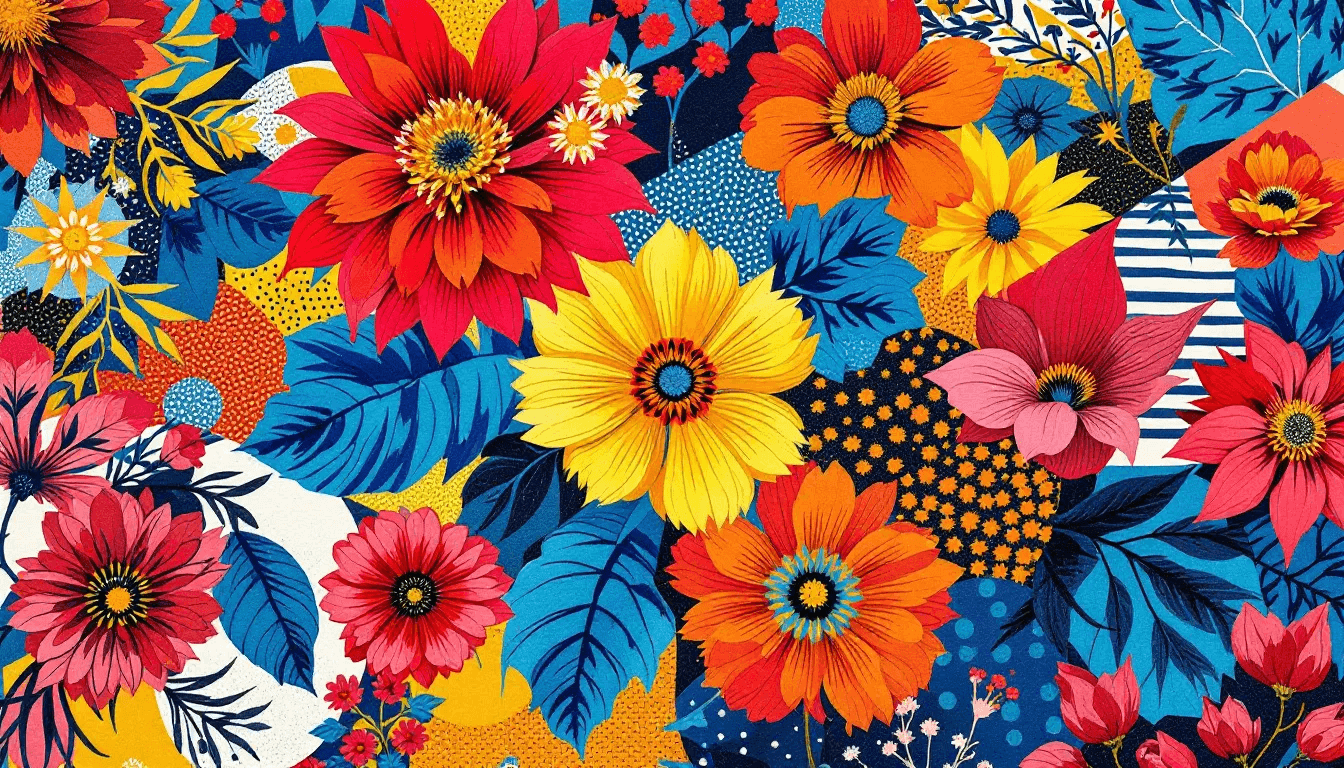
Risk-taking brands in fashion, entertainment, and lifestyle sectors frequently employ maximalist strategies to differentiate themselves in crowded markets. Music festivals, alternative fashion labels, and creative agencies use maximalist design to signal their willingness to challenge conventions and appeal to audiences who value originality over mainstream acceptance.
Characteristics
✓ Bold, high-saturation colour combinations
✓ Dense layering of patterns, textures, and imagery
✓ Eclectic compositions that break conventional rules
✓ Expressive typography integrated with visual complexity
✓ Energetic, immersive visual storytelling
Best for
✓ Fashion, lifestyle, and entertainment branding
✓ Music festivals and cultural events
✓ Creative agencies seeking strong differentiation
✓ Campaigns targeting audiences craving originality
Mood/Tone
✓ Vibrant, rebellious, expressive, unconventional
Use Sparingly When
✓ Clear hierarchy and readability are essential
✓ Audiences may prefer minimal, corporate, or restrained aesthetics
Flat Design
Flat design emerged as a digital-first aesthetic inspired by Bauhaus and Modernism principles, eliminating three-dimensional effects in favour of two-dimensional simplicity. This style prioritises clarity and functionality through bright colours, minimal textures, and simple geometric shapes that translate effectively across digital platforms and devices.
The aesthetic philosophy of flat design emphasises content over ornamentation, creating interfaces that load quickly, scale effectively across screen sizes, and maintain visual clarity under various conditions. Tech companies adopted it widely for its ability to ensure cohesive user experiences across platforms while reducing development complexity.
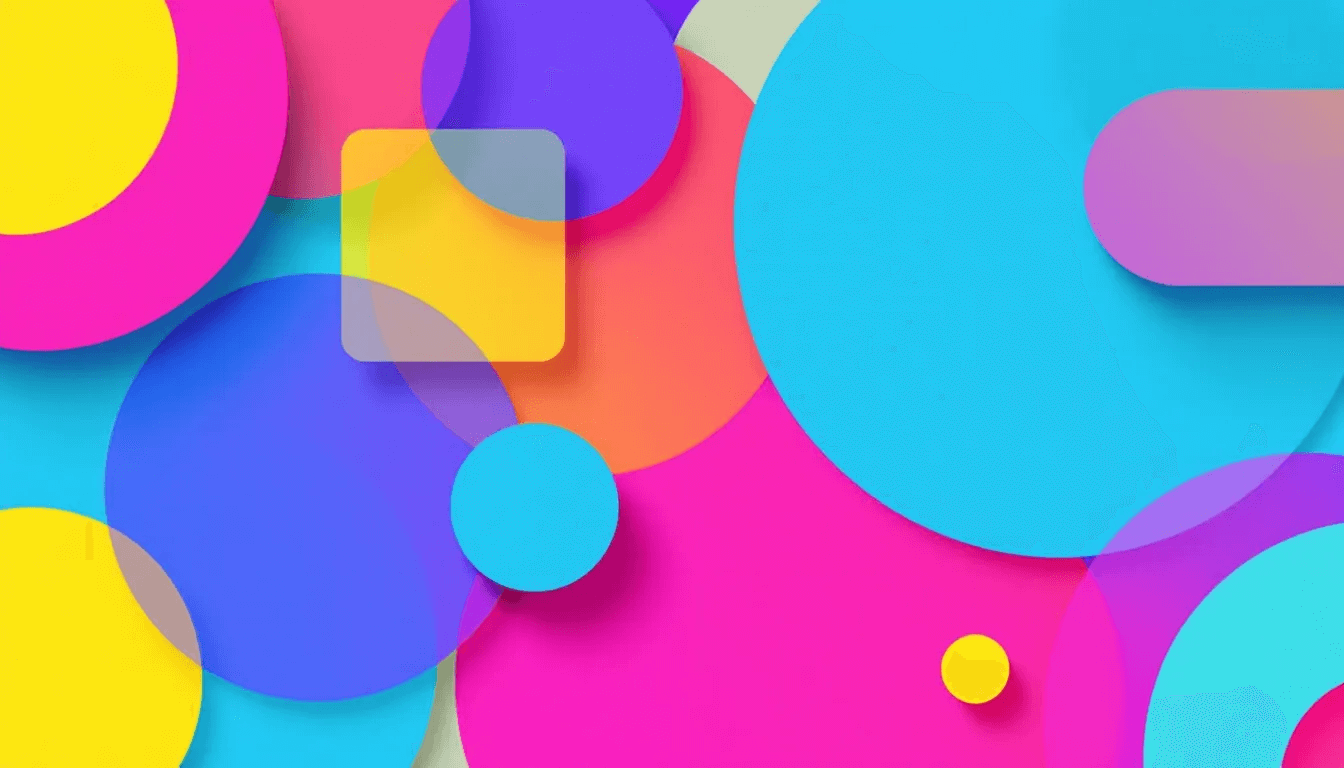
Beyond user interfaces, flat design now influences marketing materials, identity systems, and digital publications. Its clean aesthetic appeals to audiences seeking modern, efficient interactions with technology while avoiding unnecessary visual complexity.
Characteristics
✓ Two-dimensional shapes without shadows, gradients, or depth
✓ Bright, bold, and often saturated colour palettes
✓ Simple geometric iconography and pictograms
✓ Typography that is straightforward and functional
✓ Emphasis on speed, clarity, and scalability
Best for
✓ Web and mobile app interfaces
✓ Digital-first branding and SaaS platforms
✓ Infographics, dashboards, and product guides
✓ Businesses focused on usability and accessibility
Mood/Tone
✓ Clean, modern, efficient, approachable
Use Sparingly When
✓ Projects require depth, texture, or realism
✓ Excess simplicity risks appearing generic or lacking personality
Cultural and Movement-Based Design Styles
Psychedelic Design
Psychedelic design originated in the 1960s counterculture movements, creating a visual language that challenged conventional norms through vivid colours, swirling patterns, and dreamlike imagery. It emerged from anti-establishment attitudes and exploration of altered states of consciousness, developing distinctive characteristics that continue to influence contemporary creative expression.
Surreal imagery and fantastical themes transport viewers into otherworldly experiences, often incorporating nature, transformation, and cosmic references. The approach encourages active viewer engagement by prioritising expressive communication over immediate comprehension.
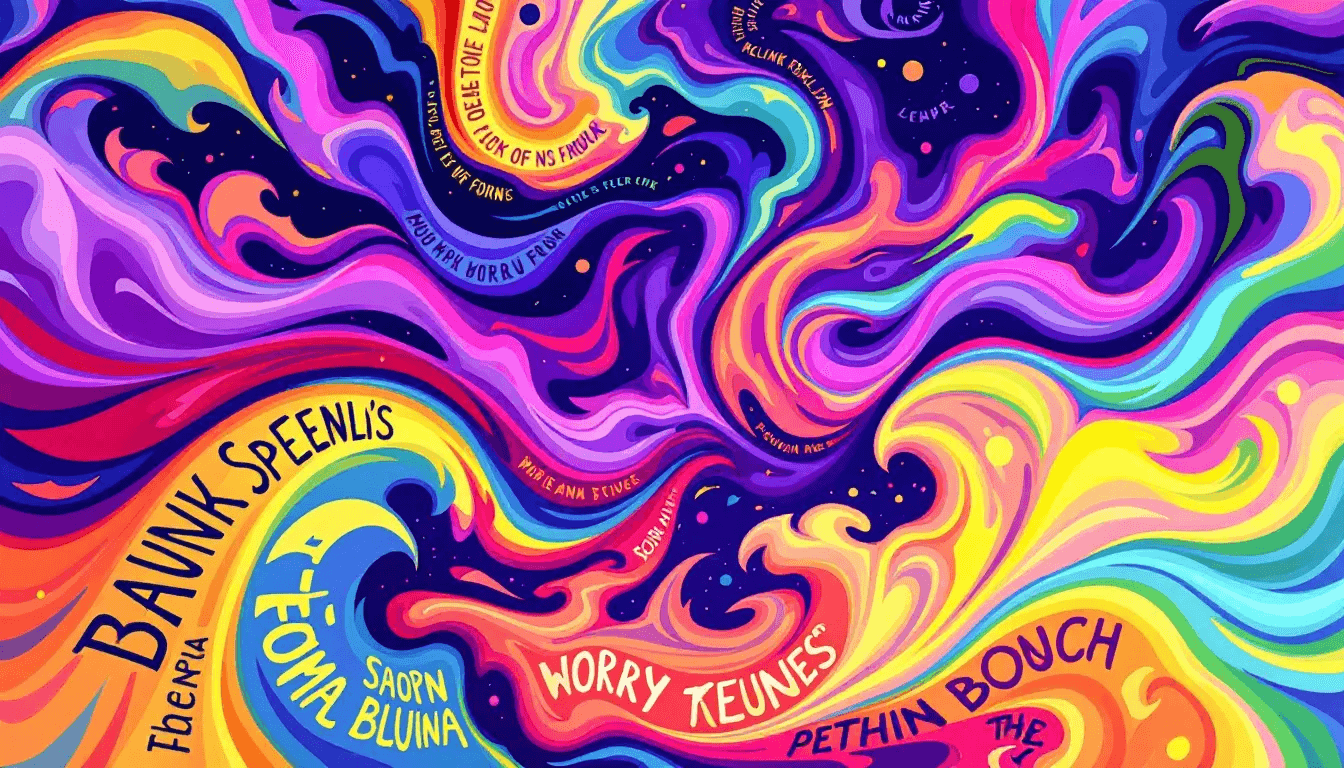
The resurgence of psychedelic design in modern culture reflects growing interest in creativity, self-expression, and alternative perspectives. Music festivals, lifestyle brands, and campaigns use it to stand out, evoke emotion, and connect with audiences seeking artistic authenticity.
Characteristics
✓ Vivid, high-contrast colour palettes and rainbow gradients
✓ Distorted, hand-drawn, or fluid typography
✓ Surreal and dreamlike imagery with cosmic or natural motifs
✓ Kaleidoscopic, swirling, and layered patterns
✓ Strong emphasis on expressive over literal design
Best for
✓ Music, festival, and entertainment branding
✓ Lifestyle products targeting creative audiences
✓ Poster design, album covers, and event promotions
✓ Brands aiming to communicate originality and freedom
Mood/Tone
✓ Trippy, vibrant, experimental, imaginative
Use Sparingly When
✓ Clear readability and instant comprehension are essential
✓ Conservative audiences may find the style overwhelming or confusing
Punk Design
Punk design emerged from late 1970s anti-establishment movements, developing a DIY ethos that rejected polished commercial aesthetics in favour of raw and authentic expression. It embodied rebellion against corporate authority and mainstream culture, creating visuals that prioritised immediacy, activism, and grassroots credibility.
Collage techniques, photocopied textures, and confrontational messaging gave punk its unmistakable edge. The style communicated urgency and independence, often using limited resources and deliberately imperfect production methods that became a hallmark of its authenticity.
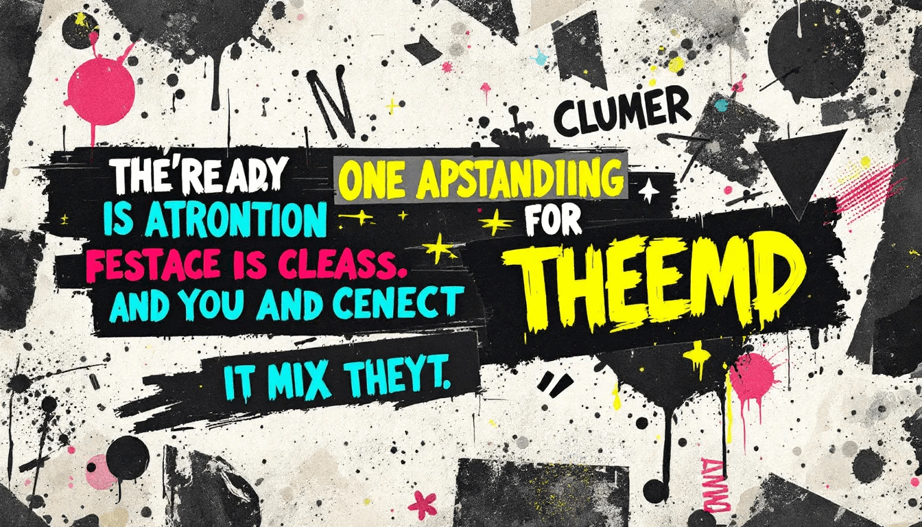
Today, punk design continues to appear in independent music, activism, and alternative fashion, appealing to audiences who value directness, individuality, and social consciousness over polish.
Characteristics
✓ Handwritten or cut-and-paste typography with rough alignment
✓ Photocopy textures, halftones, and gritty collage effects
✓ High-contrast colour palettes (often black/white with bold accents)
✓ Raw, imperfect, and deliberately chaotic layouts
✓ Visuals driven by urgency and rebellion
Best for
✓ Independent music and cultural venues
✓ Alternative fashion and youth subcultures
✓ Activism and grassroots campaigns
✓ Zines, posters, and underground publishing
Mood/Tone
✓ Raw, rebellious, confrontational, urgent
Use Sparingly When
✓ A professional, corporate, or conservative presentation is required
✓ Overuse may alienate mainstream audiences or reduce legibility
Grunge Design
Grunge design emerged in the post-2000 era, drawing inspiration from the 1990s Seattle music scene while adapting to digital media and contemporary culture. It reflected alternative influences through distressed textures, chaotic layouts, and deliberately imperfect choices that communicated authenticity and a rejection of polished commercial standards.
The style became popular with youth culture and brands wanting to project credibility and edge. Its rough, unpolished quality resonated strongly with audiences seeking alternatives to overly polished mainstream aesthetics.
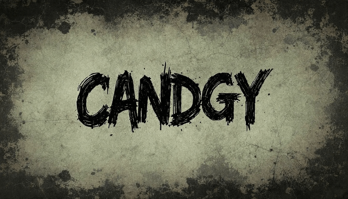
Modern adaptations often blend grunge’s raw texture with improved readability for digital environments, allowing it to remain expressive while being compatible with current user experience needs.
Characteristics
✓ Distressed textures, rips, and analog-inspired grit
✓ Rough typography with uneven baselines or hand-drawn effects
✓ Dark, moody palettes with sharp contrasts
✓ Layered collages combining text, imagery, and texture
✓ Chaotic, asymmetrical compositions
Best for
✓ Streetwear, skateboarding, and alternative fashion brands
✓ Independent music and youth-oriented venues
✓ Editorial layouts or posters seeking a raw edge
✓ Campaigns targeting subcultures valuing authenticity
Mood/Tone
✓ Gritty, rebellious, authentic, underground
Use Sparingly When
✓ Clarity and legibility are top priorities
✓ Projects require clean, corporate, or professional aesthetics
Emerging and Digital-First Design Styles
Glassmorphism
Glassmorphism represents a modern digital design style that creates translucent, glass-like effects through transparency, blurring, and layering. It adds visual depth and sophistication while maintaining clarity, making it especially popular in user interface design and digital experiences.
This style provides a polished, premium feel without overwhelming the user. Subtle shadows, frosted panels, and layered surfaces create hierarchy and focus, ensuring functionality remains intact alongside visual appeal.

Glassmorphism has become a go-to aesthetic for dashboards, mobile apps, and websites where elegance, innovation, and usability need to work hand in hand.
Characteristics
✓ Translucent, frosted-glass panels with blur effects
✓ Layered components create a sense of depth
✓ Subtle shadows and highlights for hierarchy
✓ Light gradients and glow accents for modern appeal
✓ Clean integration with minimalist layouts
Best for
✓ Dashboards and complex data interfaces
✓ Mobile applications with premium positioning
✓ Websites showcasing modern innovation
✓ Interactive designs require both clarity and depth
Mood/Tone
✓ Sleek, futuristic, elegant, refined
Use Sparingly When
✓ High-contrast readability is essential
✓ Devices or platforms cannot handle heavy effects smoothly
3D Design and Photorealism
Advanced technology has democratised 3D design capabilities, enabling realistic lighting, shadows, and textures that create photorealistic visual communications across digital and print media. This evolution represents a significant shift from flat design limitations, opening new possibilities for immersive brand experiences and product visualisation.
Professional tools now make it possible to build complex compositions that integrate seamlessly with traditional graphic design elements. Skeuomorphic principles are also experiencing a revival, with 3D techniques mimicking real-world objects and materials to create more intuitive digital interfaces.

Product visualisation has transformed e-commerce and marketing, giving brands the ability to showcase items from multiple angles with photographic quality before physical production. Logos and brand identity systems increasingly adopt 3D treatments to boost memorability, while interactive 3D elements allow audiences to engage with products and content in dynamic, immersive ways.
Characteristics
✓ Realistic lighting, shadows, and textures
✓ Photorealistic rendering of objects and environments
✓ Revival of skeuomorphic cues in digital interfaces
✓ Depth and dimensionality enhance immersion
✓ Seamless integration with traditional 2D elements
Best for
✓ E-commerce product visualisation and marketing
✓ Logo design and brand identity with high visual impact
✓ Interactive demos, explainer content, and 3D interfaces
✓ Industries requiring realism (tech, fashion, automotive)
Mood/Tone
✓ Immersive, innovative, dynamic, cutting-edge
Use Sparingly When
✓ File size and performance limitations affect usability
✓ A simple, fast-loading, or minimalist design is required
Y2K Evolution and Neo-Brutalism
Y2K nostalgia embraces late 1990s internet culture aesthetics, incorporating pixel art, holographic effects, and cybernetic themes that reflect contemporary fascination with retro-futuristic design elements. This revival movement appeals to audiences seeking authentic connections with pre-social media digital culture while exploring themes of technological optimism and digital creativity.
Pixel art and holographic treatments celebrate early digital limitations while suggesting futuristic possibilities. These techniques evoke both nostalgia and innovation, creating a distinctive link between past and present digital culture.
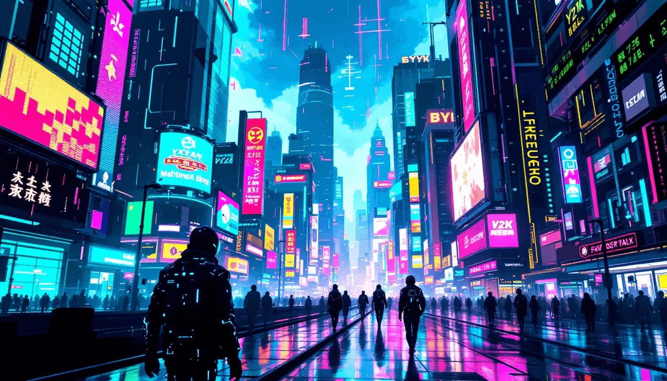
Neo-Brutalism, by contrast, draws from brutalist architecture, focusing on raw, utilitarian design. Its high-contrast visuals, blocky layouts, and deliberate awkwardness create distinctive visual identities that reject polish and embrace functional clarity.
Modern brands and creative industries blend these approaches, balancing nostalgic aesthetics with responsive, accessible, and functional design to achieve unique hybrid identities.
Characteristics
✓ Pixel art with low-resolution, blocky graphics
✓ Bright, saturated palettes and cyber-inspired motifs
✓ Holographic and iridescent gradients with metallic textures
✓ Harsh contrasts, blocky grids, and utilitarian layouts in Neo-Brutalism
✓ Deliberate awkwardness and “organised chaos” in composition
Best for
✓ Lifestyle, youth, and culture-driven branding
✓ Fashion, entertainment, and creative campaigns
✓ Social media visuals and experimental microsites
✓ Brands seeking retro-futuristic or counter-corporate appeal
Mood/Tone
✓ Nostalgic, futuristic, raw, experimental
Use Sparingly When
✓ Conservative or corporate audiences expect polish
✓ Overly complex visuals risk impairing readability or accessibility
Specialised and Target-Specific Design Styles
Corporate and Professional Styles
Corporate design styles prioritise professionalism, trustworthiness, and clear communication through conservative elements that convey stability and competence. These approaches balance aesthetic appeal with functional clarity, creating visual communications that build confidence with business audiences while remaining broadly accessible.
Business presentations, annual reports, and B2B marketing materials benefit from corporate design’s emphasis on systematic organisation and credibility. Simple icons and clean visual elements support textual content, ensuring that design enhances rather than distracts. This makes it particularly valuable for professional services, financial institutions, and technology companies that must communicate expertise and reliability.
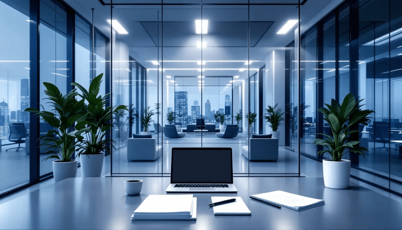
Modern corporate applications continue to evolve with subtle contemporary touches, but always maintain the foundations of clarity, legibility, and professionalism.
Characteristics
✓ Serif fonts for print and clean sans serifs for digital
✓ Grid-based layouts for systematic organisation
✓ Muted, complementary colour palettes with restrained accents
✓ Simple icons and visuals that support content
✓ Clear hierarchy emphasising accessibility and legibility
Best for
✓ Financial institutions and professional services
✓ Technology companies and corporate communications
✓ Business reports, proposals, and investor materials
✓ B2B marketing and presentations requiring credibility
Mood/Tone
✓ Professional, reliable, authoritative, structured
Use Sparingly When
✓ A brand requires creativity, playfulness, or emotional storytelling
✓ Overly conservative visuals may make communication feel dated
Organic and Natural Design
Organic design styles celebrate natural textures, fluid shapes, and earth-tone palettes that create visual connections with environmental consciousness and authentic craftsmanship. This approach appeals to audiences seeking alternatives to digital uniformity and corporate sterility through elements that suggest handmade quality and environmental responsibility.

Botanical imagery and rustic details reinforce brand values around sustainability, health, and authenticity. This makes the style especially effective for businesses in wellness, food, and lifestyle sectors looking to highlight natural origins and artisanal quality.
Characteristics
✓ Natural textures like wood, stone, and botanicals
✓ Hand-drawn lines and fluid, organic shapes
✓ Earth-tone palettes with natural variations
✓ Custom typography with organic, crafted qualities
✓ Rustic details that emphasise imperfection as authenticity
Best for
✓ Wellness, food, and environmentally conscious brands
✓ Sustainable product packaging and eco-friendly campaigns
✓ Lifestyle businesses emphasising authenticity and craft
✓ Artisanal goods and premium natural offerings
Mood/Tone
✓ Warm, earthy, authentic, mindful
Use Sparingly When
✓ Brands require sleek, corporate, or high-tech aesthetics
✓ Too many natural details risk cluttering clean modern layouts
Geometric and Mathematical Styles
Geometric design styles utilise straight lines, precise shapes, and mathematical relationships to create orderly, systematic communications that suggest precision, reliability, and contemporary sophistication. This approach appeals to audiences seeking clarity and modern appeal through visuals that demonstrate technical competence and structured thinking.
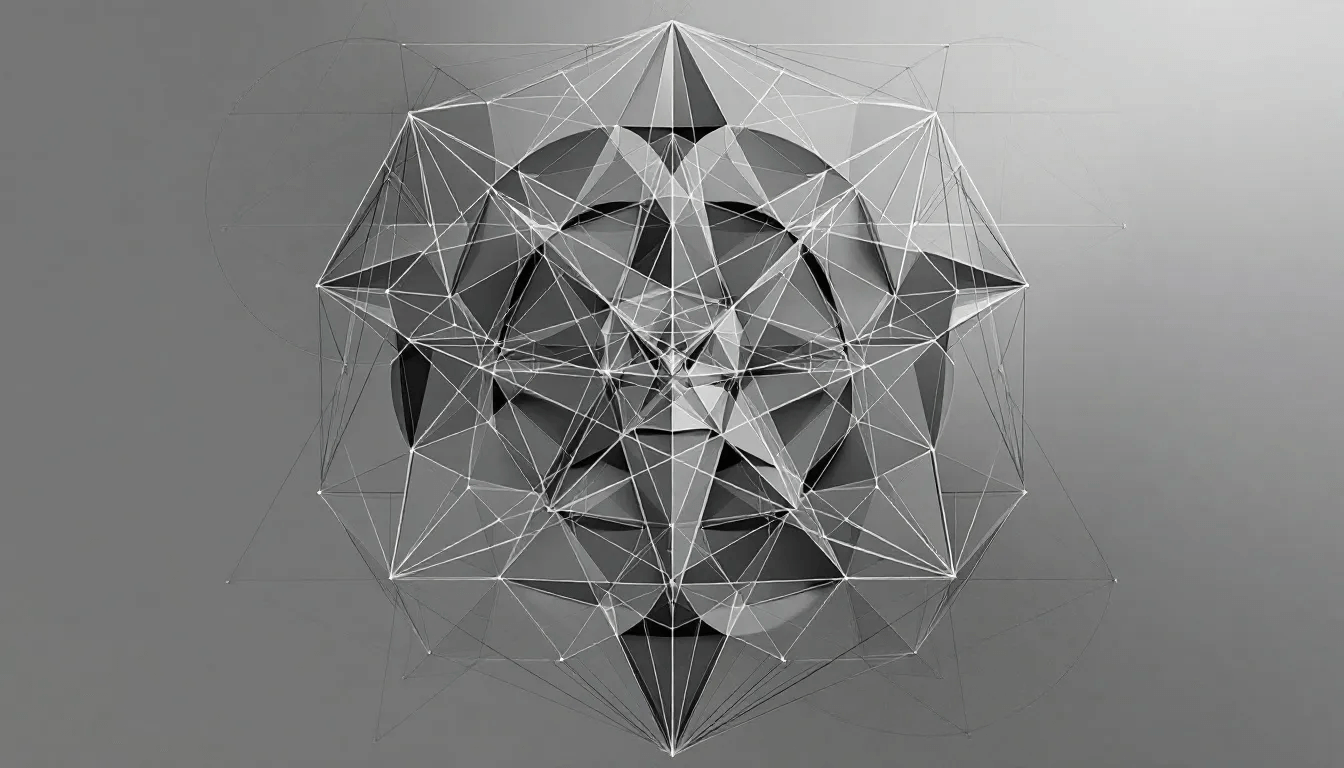
The style translates seamlessly into both branding and digital platforms, where balance, proportion, and clarity are crucial. It also plays a role in modern art and architectural applications, combining systematic order with bold creative expression.
Characteristics
✓ Straight lines, sharp angles, and precise geometric forms
✓ Symmetrical layouts with balanced proportions
✓ Bold contrasting colours with limited, systematic palettes
✓ Strong grid systems supporting visual hierarchy
✓ Clean, mathematically inspired compositions
Best for
✓ Tech branding and innovation-focused industries
✓ Corporate identity systems and digital platforms
✓ Infographics, data visualisations, and systematic layouts
✓ Modern art, architectural, and experimental applications
Mood/Tone
✓ Precise, reliable, structured, contemporary
Use Sparingly When
✓ A softer, more organic or emotional style is required
✓ Excess rigidity may limit creative expression or relatability
How to Choose the Right Graphic Design Style for Your Brand
Selecting the right graphic design style requires a systematic analysis of your target audience demographics, cultural preferences, and psychological associations that influence purchasing decisions. Understanding your audience’s age, income level, cultural background, and lifestyle preferences provides essential context for making informed style decisions that resonate with their expectations and values.
Brand personality alignment ensures that your visual style accurately reflects your company’s core values, mission, and positioning strategy. Conservative brands benefit from classic styles like Swiss Design or Corporate approaches, while innovative companies might explore contemporary options like Maximalism or Glassmorphism to communicate forward-thinking attitudes and creative leadership.
Industry standards and competitor analysis reveal opportunities for differentiation while identifying potential risks of appearing too unconventional for your market context. Technology companies often gravitate toward Minimalism or Flat Design, while luxury brands frequently employ Art Deco or sophisticated Geometric approaches that communicate exclusivity and premium quality.
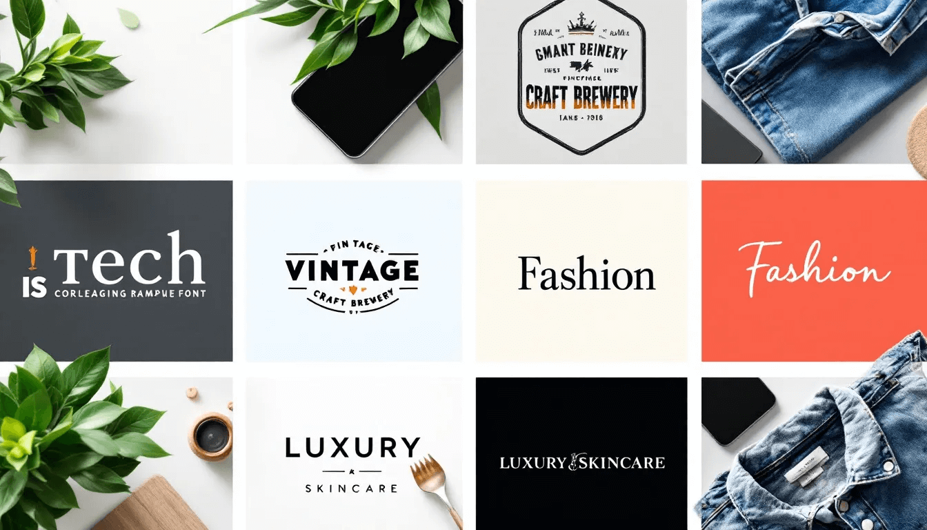
Functional requirements and usability considerations must balance aesthetic preferences with practical communication needs across different platforms and media formats. Complex information requires a clear hierarchy and excellent readability, making styles like Swiss Design or Corporate approaches more suitable than highly decorative options like Psychedelic or Art Nouveau.
Testing different styles through A/B testing and audience feedback provides objective data about audience preferences and engagement levels with various aesthetic approaches. Digital platforms enable rapid testing of different style applications across marketing materials, social media content, and website elements to identify approaches that generate optimal user response.
Platform-specific adaptations ensure that your chosen style translates effectively across web design, print materials, social media content, and mobile applications. Some styles that work well in print may lose impact in digital formats, while others designed for screen display may appear weak in printed marketing materials.
Combining and Evolving Design Styles
Experimenting with multiple style combinations creates unique brand identities that stand out through innovative approaches while maintaining coherent visual communications. Successful hybrid strategies often combine complementary elements from different movements, such as incorporating Minimalist organisation principles with Organic textures or Geometric structures with Contemporary colour palettes.
Geominimalism represents one successful hybrid approach that combines Minimalist spatial organisation with Natural elements and organic textures. This combination appeals to audiences seeking both modern sophistication and authentic connections with environmental consciousness, creating distinctive positioning for wellness brands and sustainable products.
Adapting classic styles for modern digital applications requires understanding both historical context and contemporary technical requirements. Art Deco elements can be simplified for mobile interfaces while maintaining the style’s luxury associations, or Psychedelic patterns can be optimised for social media while preserving their creative energy and countercultural appeal.
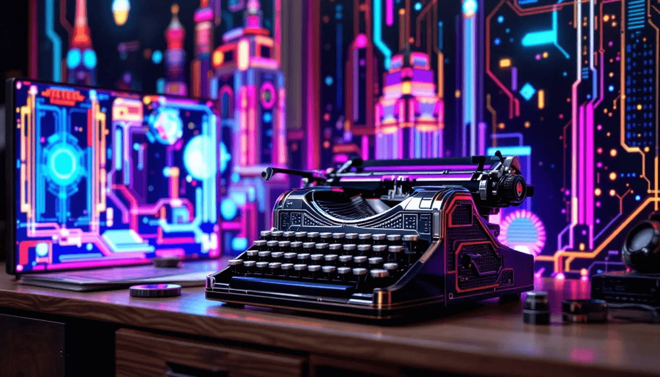
Staying current with emerging trends while maintaining brand consistency requires systematic evaluation of new aesthetic developments and careful integration that enhances rather than contradicts existing brand identity. Design trends offer opportunities for refreshing brand communications without abandoning core visual identity elements that support recognition and trust.
Building a personal design library and reference collection enables ongoing inspiration and systematic exploration of style evolution possibilities. This resource should include historical examples, contemporary applications, successful hybrid approaches, and emerging techniques that might inform future brand development decisions.
Understanding the cyclical nature of design trends and cultural influences helps predict potential opportunities for refreshing brand communications while avoiding premature adoption of unstable trend elements. Design styles often experience revival cycles influenced by cultural nostalgia, technological capabilities, and generational preferences that create opportunities for strategic brand evolution.
The future of graphic design styles will likely continue blending traditional approaches with digital innovations, creating new categories that honour historical design wisdom while embracing contemporary technical capabilities and cultural values. Successful brands will balance respect for design traditions with willingness to experiment and evolve their visual communications as audience preferences and cultural contexts continue to change.
Turn Creative Styles into Business Success
Knowing the difference between design styles is only half the journey the real impact comes from applying them in ways that strengthen your brand and drive results. From clean minimalism to bold maximalism, every style can be transformed into a business advantage when used with purpose.
At Rivet Digital, we make that transformation simple. Our unlimited graphic design service gives you access to a dedicated creative team who can adapt styles to your brand’s unique goals, ensuring every asset looks professional, consistent, and engaging.
Key Takeaways
Understanding graphic design styles empowers you to make strategic visual decisions that strengthen brand communication and audience connection. Each style carries distinct cultural associations and emotional impacts that can either amplify or undermine your marketing efforts, making informed selection essential for business success.
Classic styles like Art Nouveau, Art Deco, and Swiss Design continue providing valuable foundations for contemporary applications, while emerging styles like Glassmorphism and Y2K Evolution offer opportunities for innovation and differentiation in crowded markets.
The strategic combination of style elements often produces more distinctive results than pure adherence to single aesthetic approaches, enabling brands to create unique visual identities that reflect complex positioning and diverse audience appeals.
Regular evaluation and thoughtful evolution of your graphic design style ensures continued relevance and effectiveness as cultural preferences, technology capabilities, and competitive landscapes continue changing. Building systematic understanding of design principles enables confident decision-making and creative exploration that supports long-term brand success.
Your visual style choices ultimately determine how quickly and accurately audiences understand your brand personality, making this decision one of the most important investments in your marketing strategy and business development efforts.
